|
Pillow TalkDigital Painting
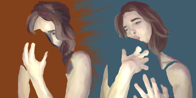
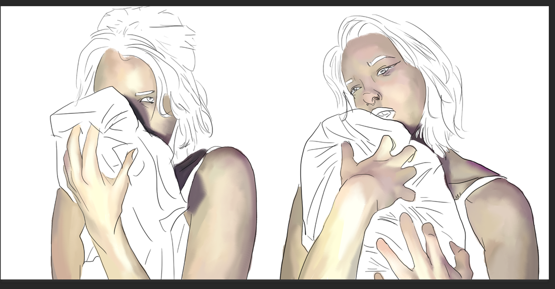
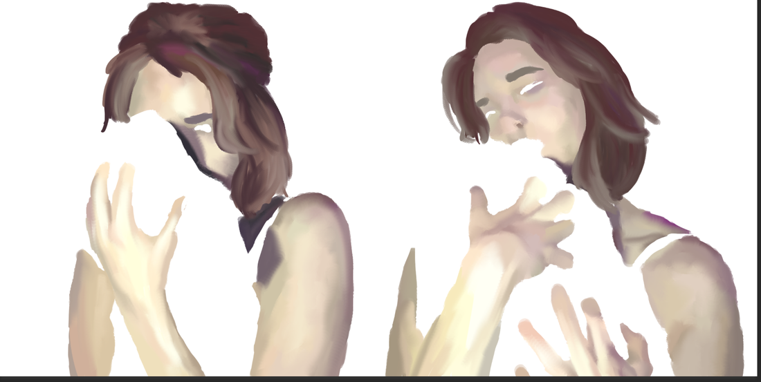
11.4 x 17.78cm October 2016 This piece focuses on empty space and expression of the same emotion in different facets of life. The empty space is a representation of something missing from the subject's life and the reactions to this object vary based on the emotions felt via the background colors. The generally cold and muted tones add a cold tone to the piece overall.
|
Planning
At the the time I began this piece, my long distance partner of over a year had left me just that day. My sadness was short lived, but it was still an emotionally and mentally rough time to follow through. Being with that person was so difficult day in and day out that it took a huge strain on my already unstable mental and emotional health; the stress of constant messaging and calling and saving up money to see each other a few times every year slowly led into an abusive relationship. For about three months this person had gaslit me and made me feel crazy, like I needed help when I was just stressed out that they were sleeping around in what was supposedly a monogamous relationship. I envisioned a piece where I could show just how upset I was with what happened, but the relief that I would not have to respond to a person who made me cry every night. The idea came about easily due to the fact that I saw my partner maybe 70 days out of a year and would go long months without them, so it seemed only natural for my piece to go in a direction where there was empty space personified.
|
Who I was most inspired by is Xiaoye Chen. He is primarily a digital painter and his use of very fluid strokes that seem almost messy but come together was what I wanted to incorporate into my final piece. I appreciate the almost rough and jagged edges of the piece; they give the picture a kind of hardness that makes the figure appear to be angry or impatient. This was exactly the kind of aesthetic I had wanted to put into my piece but also have my own style applied to make it truly relateable to myself and my experiences.
|
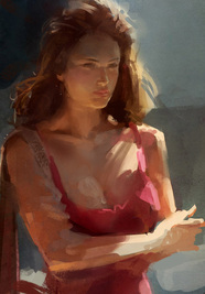
Xiaoye Chen, "Woman in Red".
My planning sketches were very successful, in that I was able to draw even without a reference and that made me feel really accomplished of myself. It was a great success to be able to make something proportionate without having to look at a reference photo; typically, I always take a picture of myself to get the shading correct, but I did that process in the opposite order just to confirm shading when I was working on the final product above.
|
Process
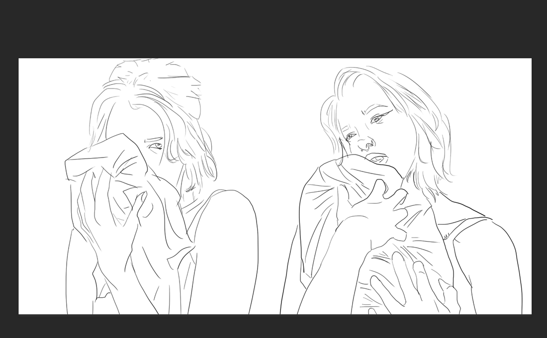
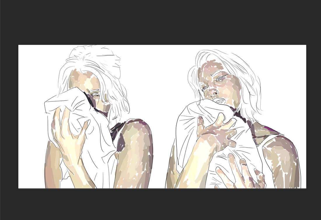
My initial reaction to my idea was to create a painting so I could play with texture more and create a rough feeling with the piece. However, I did not have the materials that I would have needed, nor exactly the motivation to create a large scale painting. I decided to utilize the medium that I was most comfortable with, and that was digital painting. I scanned my planning sketches so I could more easily get the line movement that I wanted in my final piece - sketching is much easier on paper than on the computer for me - and was able to clean it up as well as create a smoother line. Later I would decide to remove the line itself for the final piece to create sort of a rougher and more untethered look, but at least in the beginning it is easier to "shade map" with an outline.
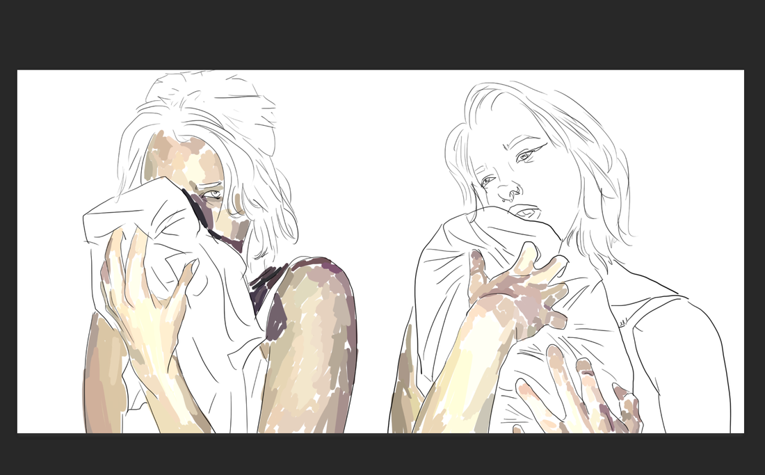
I experimented with a new technique that I adopted from my inspiration of Xiaoye Chen, which was blocking in areas of color before making them look more blended together. In Photoshop, I used the Mixer Brush tool to blend these areas of color together, and it created a very smooth look. When I removed the line as shown in photo six above, the shading actually looked much more rough than it did when the line was still around. I was upset in that moment, but later came to love the look of it and actually decided that it helped advance the meaning of my piece rather than make it look unprofessional or unfinished.
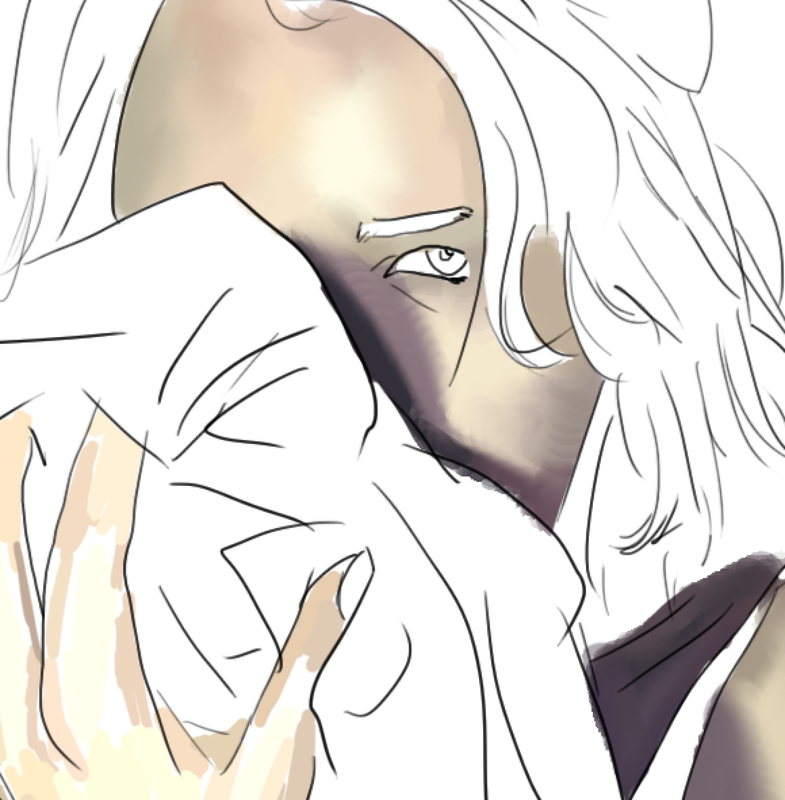
My first reaction to the figures being finished in the piece was that it looked finished as it was. As well as that, the thought of implications stuck. The object (a blanket) in the figure's hand was originally going to be completely colored and shaded like the figures, however, having an implied image allows a viewer to be able to imagine what the figure is missing in the end.
I experimented with a new technique that I adopted from my inspiration of Xiaoye Chen, which was blocking in areas of color before making them look more blended together. In Photoshop, I used the Mixer Brush tool to blend these areas of color together, and it created a very smooth look. When I removed the line as shown in photo six above, the shading actually looked much more rough than it did when the line was still around. I was upset in that moment, but later came to love the look of it and actually decided that it helped advance the meaning of my piece rather than make it look unprofessional or unfinished.
My first reaction to the figures being finished in the piece was that it looked finished as it was. As well as that, the thought of implications stuck. The object (a blanket) in the figure's hand was originally going to be completely colored and shaded like the figures, however, having an implied image allows a viewer to be able to imagine what the figure is missing in the end.
Reflection
Looking at the piece, I believe I definitely could have done better. The facial features are unattractive and not like something I would normally draw. However, I think that's what creates the appeal to this piece. The story behind the meaning of it is very ugly, and incorporating that idea into the final product makes the implied imagery that much stronger to a viewer. I decided on instead of having a complicated background to distract from the foreground, just having two solid colors that clashed at the middle would do. I used earthy tones of the complimentary colors of blue and orange. The orange behind the right figure implies an anger or an intimidation, which coincides with the look in the figure's eyes. The blue implies a sadness or a slow movement, which as well as the figure on the left coincides with the posture of the figure on the right as well as the look in the eyes.
The dark purple used as a darker value tone adds a mixture of the warm and cold colors of red and blue, which mixes up anger as well as sadness. These two emotions are the strongest behind the piece.
The dark purple used as a darker value tone adds a mixture of the warm and cold colors of red and blue, which mixes up anger as well as sadness. These two emotions are the strongest behind the piece.
