Reflection and Circumstance |
Oil and Acrylic on canvas, 2016, 91.4cm x 121.92cm
This triptych piece inspires a sense of movement along all three of the canvases due to the varied sizes of the subjects as well as the seemingly randomized placement of state flowers which also introduce the theme of the ‘artist in the city’. The use of all three primary colors in shading skin tones helps add unity to the piece, even though the pieces do not physically and/or visually connect. Inspirations from impressionism and surrealism create a unique blend found in this piece. |
|
|
|
Planning
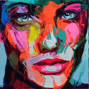
When I had first heard about this project, I was honestly a little upset. My last painting, nonetheless my last project, was also a tryptic and I was hoping that I would have an opportunity to create something new. However ideas started to come to me. I knew from the beginning I wanted a bold, colorful look in contrast to my previous self portrait. I stumbled across an artist named Françoise Nielly and I immediately fell in love with his art. It reminds me of my friend's mom's paintings so it is a familiar style to me. However, the way he created his artwork is foreign to me; Nielly uses a palette knife to create his artwork. I know that if I want to use him for sure I'm going to need to practice this technique before I really begin my painting.
Something I observed from looking at his art is that primarily pastels, neons and light cold colors are used for the highlights, while colors like red-orange, red, purple, and black are used for the contours and highlights. The eyes are also quite realistic despite the colorfulness of the rest of the piece. The most important part to recognize, I believe, is the balance of colors. The dominant color in most of Nielly's pieces is a blood orange like color, which I believe is used for the base coat for the faces. In his more appealing works such as the second example below, the complimentary color is used for shading in some parts but definitely not all. Different saturations, hues and shades of that color (blue in the example) is used for either highlight or contour. Then, a neon color in the same warm or cold family as the base coat is used for more highlights. I feel as though it is important to notice these seemingly small things if one truly wants to emulate or bring another artists' style into a piece.
Something I observed from looking at his art is that primarily pastels, neons and light cold colors are used for the highlights, while colors like red-orange, red, purple, and black are used for the contours and highlights. The eyes are also quite realistic despite the colorfulness of the rest of the piece. The most important part to recognize, I believe, is the balance of colors. The dominant color in most of Nielly's pieces is a blood orange like color, which I believe is used for the base coat for the faces. In his more appealing works such as the second example below, the complimentary color is used for shading in some parts but definitely not all. Different saturations, hues and shades of that color (blue in the example) is used for either highlight or contour. Then, a neon color in the same warm or cold family as the base coat is used for more highlights. I feel as though it is important to notice these seemingly small things if one truly wants to emulate or bring another artists' style into a piece.
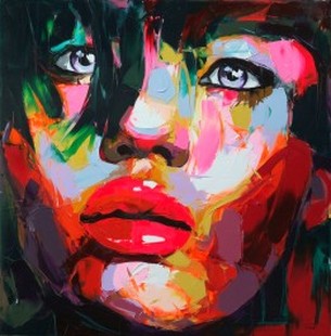
Françoise Nielly, UNTITLED 611, 2011
|
Françoise Nielly, UNTITLED 909, 2015
|
Now knowing the style I wanted to use, I could start my planning sketches. Before I found an artist inspiration, I was doing all of my sketches just based off of pictures taken of me without a real connection nor idea. Now I could begin taking new photos to work from that appeared similar to the poses used in Nielly's work.
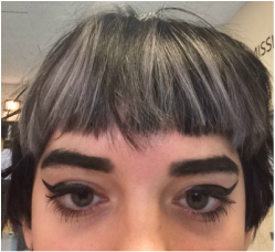
Planning Photo 1
|
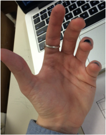
Planning Photo 2
|
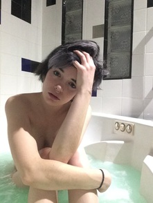
Planning Photo 3
|
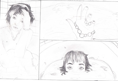
Planning Sketch 1
|
I used the three photos above (1, 2 and 3) to create the planning sketch to the left. I wanted to create more of a surreal effect for the second and third pictures because as the tryptic continues, the pieces become less and less in touch with the first perception portrait. I also plan to switch the third piece with the second piece in placement (the hand and the head coming out of the water) because I feel as though it will flow better with my finished product. I chose to use a bathtub as my metaphor because my bathtub is one of my favorite places in the house and it is a place where I can do self reflection and not have to deal with anyone else for a long time. However, sometimes I get lost in the bath, as shown literally in the second and third portraits.
|
This is where I began to stop what I was doing.
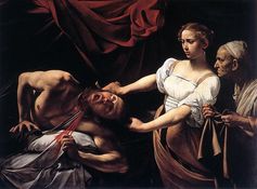
I did some practice with the palette knife technique but it did not turn out well at all. I began to grow frustrated and upset with any and all results that I had. I began looking through my art journal from last semester and fell in love with Baroque styled art due to its dark themes and subtle shading. I specifically looked at Caravaggio's art, because I remembered it from sophomore year.
|
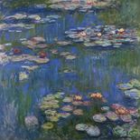
The painting, "Judith Beheading Holofernes" by Caravaggio is very theatrical and dark, and the shading is very enticing to me. The black background seems to make the figures jump out from the painting and I liked that about this piece. Baroque art also attempts to be dramatic, authoritative, and powerful, and this piece successfully portrays all three. The skill necessary to create such a realistic image is very enticing to me. Although my finished product was not nearly as realistic as any Baroque art, I am still happy with it. I want to take parts of the Baroque creation process such as the dark shading and the theatrical juxtaposition and put it into my own pieces. Another piece I used for inspiration was actually a series. Monet's "Water Lilies" inspired my flower design and the connection between all the paintings with these flowers.
|
Process
|
|
I knew I wanted to use oil paints to create a smooth and blended effect. It took me a while to finally incorporate the project's meaning into my piece.
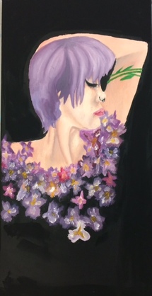
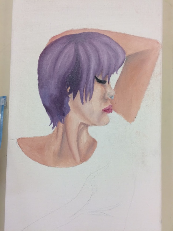
Firstly, my self-perception piece uses a red toned skin tone to invoke a warm feeling while not being too menacing. I attempted to emphasize all the shading and the veins in the neck and although this is not specifically baroque style I believe it fits in due to the dramatic shading. I put violets around my body, covering my chest because violets are Wisconsin's state flower and I felt it connected my piece to the other two with these flowers. I took inspiration from Monet's Water Lilies piece for the flowers because Impressionism had been my first portal into the art world along with Degas' art. I blended the hair very smoothly and carefully because I view myself as someone who takes great pride in her hair. My hair is a lavender purple in the painting because that is the hair color that I believe looked the best on me and that I could see myself having for a long time. The figure itself is smaller than the other two figures painted because I view myself as a very small person in terms of perspective of the earth. |
|
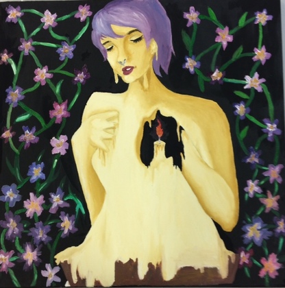
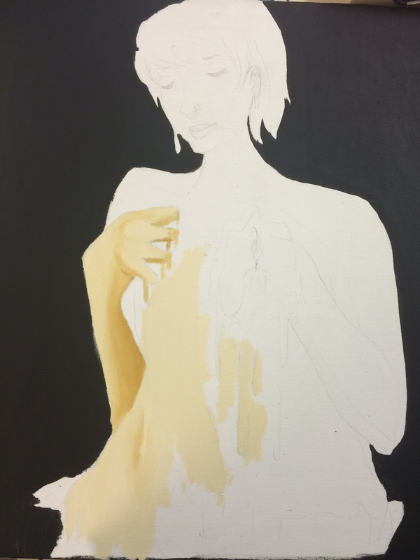
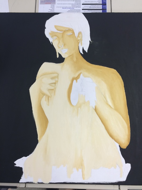
My second painting in the series is the 'City in the Artist' and it features myself clutching my body as a hole is melted where my heart should be by a candle. This represents that although Milwaukee is my home and in my heart, and it will always be a fire burning in my chest, I cannot wait to leave because it is melting me alive from the inside. I attempted to mix a beige candle wax color to create the illusion of a candle and compliment my red self perception and blue artist in the city, but it did not turn out that way and I look more like butter. However, I believe that I can use that to my advantage and use the color as cultural inspiration due to the fact that Wisconsin is the dairy state and produces much butter for the United States. Butter also melts much like a candle, albeit much faster.
|
|
|
|
|
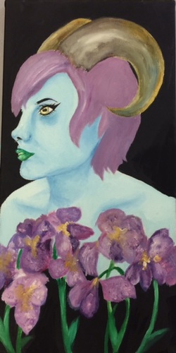
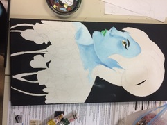
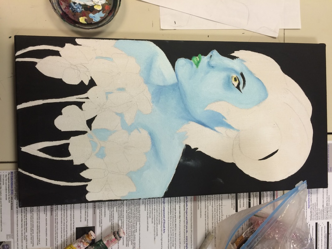
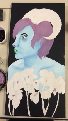
My third piece, 'Artist in the City', features a self portrait using a blue as the skin tone. The blue is due to how I affect the city; many of my friends tell me that I am a bummer as well as not very fun to be around. Blue is the color of sadness so I believe it is fitting. The horns were painted on to create the illusion that I am a sheep. I wanted that illusion because I affect the city by consuming and taking in everything around me, and I mostly try to follow the crowd when in public and blend in like a sheep. The blue skin also ties the three pieces together- the first piece is red toned, the second is yellow, and this third is blue. This gives a sense of harmony between the paintings although this third one is proportionately much larger on the canvas. Violet flowers were also added to this piece to add more of a sense of flow.
|
Reflection
These pieces help a viewer envision what I personally had going through my head at the time these pieces were created. I believe the skin tones of the three paintings across the board help give a sense of harmony and connection between the otherwise three quite distinct pieces. I believe my project was a success and very honestly it almost gave me anxiety knowing that I will be moving to a different state in a little over a year. I am going to miss my hometown but I am very excited to get a fresh start. I am very likely to bring these paintings along even if I think they are bad in the future because they will make me feel more at home. These paintings have helped me get connected to my hometown and appreciate it more.
