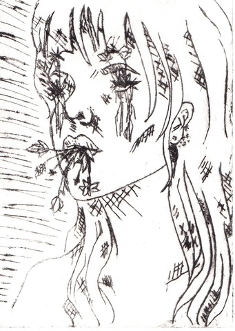
Bloom
Dry Point
17.5x12.5cm
2015
Second in the "Roots" series, this piece exemplifies movement and contrast especially when compared to the previous work, Rot. The sketchy looking print and use of crosshatching helps a viewer relate somewhat because nobody is immaculate, like the photo.
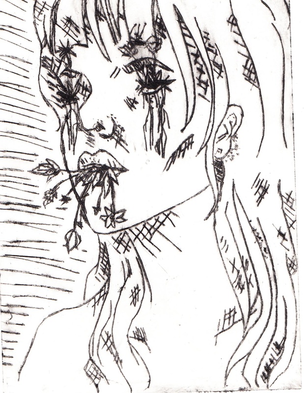
Dry Point
17.5x12.5cm
2015
Second in the "Roots" series, this piece exemplifies movement and contrast especially when compared to the previous work, Rot. The sketchy looking print and use of crosshatching helps a viewer relate somewhat because nobody is immaculate, like the photo.
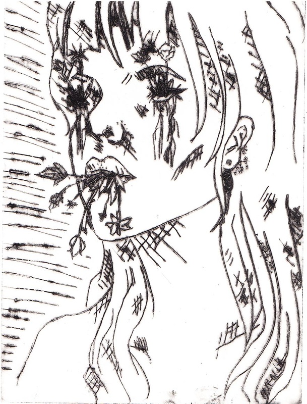
Planning
|
My first impression of this project is that my finished piece would end up somewhat the same in process to the previous project, my block print. Since there were no examples of the project yet, my class and I had nothing to work with in terms of inspecting how other classes had done theirs as well as their successes and failures. We had the same guidelines as we did for the block print, as in making sure we had a theme and we were able to connect it to an artist. Thinking about how the process went, I thought more about veering towards pop art since contour art was more viable for this project. For my first planning sketch (Planning Sketch #1), I based it off Roy Lichtenstein's piece, Crying Girl (1). Even though our project did not involve color, the colors of the piece really attracted me to it from the use of the primary color triad. I did a sketch using the theme of loneliness, and rolled in modern technology by creating a notification bubble on the drawing that means there are no notifications on recent posts. This ties into the theme of loneliness because some people are so dependent on their social media presence that it is all that matters to them. It was not my favorite sketch though, so I continued exploring ideas. My second idea was to incorporate an illustrative sort of fantasy element into my piece (Planning Sketch #2). In the picture, it is nighttime, and the wind is blowing, making the piece more mysterious. I didn't like this one nor Planning Sketch #3, and I was out of ideas, until I had the idea to tie this piece as well as my previous print together. I resized my final planning sketch from the block print project and flipped it so it would be facing the opposite way. Using a light box, I then traced the piece's basic facial and body structure and from there I made it more of an original piece. My theme for this dry point project is being able to find yourself and grow with yourself, the complete opposite of the block print. I felt as though the two finished projects should be presented together so they can contrast with each other and emphasize both of their main themes. My final planning sketch (Planning Sketch #4) has shading by using crosshatching and stippling which can relate to both the Pop Art and German Expressionism movements.
|
|
Process
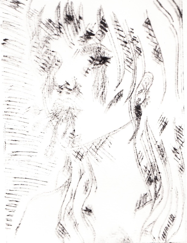
To begin, I got a clear plastic plate and taped it on top of my final planning sketch. I used a tool that was more like a scratching tool and was very uncomfortable to hold. The worst part about this project was the actual creation of the plate because tracing is not what I like to do and I was nervous that I would mess up. It was impossible to erase or remove any mark that was made before, which is why it made me so nervous. It can be seen on my final piece on the girls' outer contour cheekbone that this mistake was made. The tool quickly made my hand sore and it was a slow process because of the periodical breaks that almost became necessary in order to keep quality high. Once the plate was finally ready, the inking process was able to begin. That process was completely different from the inking process of the block print. First of all, there was a different kind of ink. It was more watery than the other ink that was used. We had to spread that ink all over our plate and rub off all the ink besides the ink that was in the indents in the plate. Secondly, the paper that we printed on was much thicker and had to be soaked in water for eight minutes prior to printing, in order to correctly transfer completely. It took much longer to make a single print with this process than it did with the block print, but these prints were more accurate and really emphasized lines. It took the same amount of effort to rub the ink off the plate with newspaper strips as it did using the tool to help transfer the block prints' ink to the paper. This process quickly became tiring, just like the etching process. Once the plate seemed clean, we had to use a printing press that was attached to the table. The press was also anxiety inducing to use, because the first few cranks of the lever were all you could do unless you wanted a double print. On my second try, I made my final print, but I still decided to make two others to see if they would turn out better.
Click on the images below to see them larger.
Reflection
The dry point was not a stronger success than the block print, but it definitely beat the digital collage in quality. The first print I did had turned out like that because I did not soak the paper in water at all, but only sprayed it a bit with water. This made it so my paper was not as malleable and did not go into the etchings on the plate when I was transferring the print to the paper. My second print was lighter than my third and fourth ones, but I chose it as my final because it was higher quality in that it did not bleed out from too much water still in the papers' fibers. The third was the one with the highest quality of lines, but it was not completely clean and the fourth one bled out way too much to even be considered for my final piece.
I think that overall the project was a success in getting across the point with the minimal use of line and contour. The piece works better when displayed alongside the block print, because they contrast with each other and along with adding balance the movement in the conjoined pieces is stronger.
I think that overall the project was a success in getting across the point with the minimal use of line and contour. The piece works better when displayed alongside the block print, because they contrast with each other and along with adding balance the movement in the conjoined pieces is stronger.
