Milwaukee Flag Design
|
Graphic Design
Photoshop 2015 |
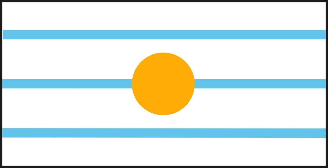
Complimentary colors contrast in this graphic design piece. The large orange circle demands attention from a viewer but the symbolism lying behind the sky blue stripes cannot be forgotten either. The piece, as a whole, symbolizes Milwaukee in that Milwaukee is where it is because of the placement of the three rivers, and the orange represents the sun coming up over Lake Michigan.
|
Planning
In working on this project, I tried to keep two things in the back of my head. One, I wanted the flag to reflect the three major rivers that Milwaukee are based upon in order to give tribute to the natives that resided here before German rule took over, and two, that the colors should be orange, blue and white.
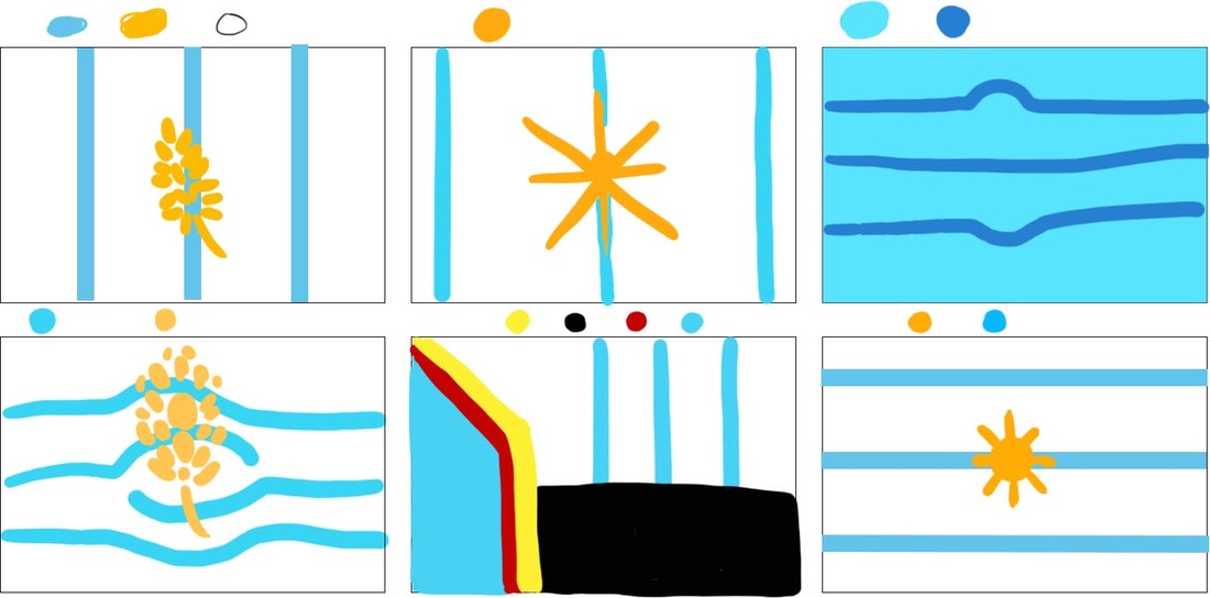
I originally drew my flag designs on plain paper. The colors were choppy at best and the image would never be as crisp as I would hope if I did not transfer my art to the computer. Using the two rules that I made for myself above, and the elements of flag design, I began working on my planning sketches digitally in Photoshop.
The elements of flag design are as follows.
1) Keep it simple.
2) Use meaningful symbolism.
3) Use two to three basic colors.
4) Do not use lettering or seals.
5) Be distinctive, or related
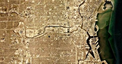
(1) Overhead view of Milwaukee
via Google Maps
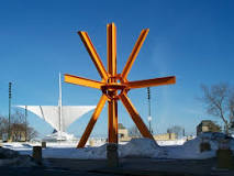
(2) di Suervo, Mark. "The Calling". 1982.
(c1) Gurda, John. Milwaukee: A Tale of Three Cities. Milwaukee: Milwaukee Public Television, n.d. PDF.
|
These were only my sketches, so they were a bit sloppy.
I attempted to stick to two basic colors; a golden orange and a darker baby blue. I utilized line for all the pieces in order to symbolize the Kinnickinnick, Milwaukee, and Menominee rivers. Milwaukee was built where it was despite the swampy conditions because it is the epicenter of the three rivers converging and emptying out into Lake Michigan. This is an important part of Milwaukee's history in that the placement of the city may have differed incredibly depending on the position of the rivers. (c1) Although industry has polluted these rivers somewhat, especially the beer companies that Milwaukee is so renowned for, the orange in the flag designs symbolizes the yellowish color grain has as well as hint at the art piece The Calling in Downtown Milwaukee. The orange of the public piece contrasts with the sky and the lake, and adds more definition to specific angles of the Calatrava. I had always liked that piece although many citizens of Milwaukee think that it is an eyesore. I used to climb on it as a child and it reminds me of my childhood so I wanted to incorporate it into my piece somehow just to add a personal touch. The relation is not extremely obvious though, the only hint is the orange color of the circle but that also symbolizes other things as well at the same time. Finally, the black border around the edge symbolizes Milwaukee's history of being separated from other areas and becoming its own metropolis, and not just a "suburb of Chicago" as many people think it is. Milwaukee is its own place and has its own culture and life, and the black line symbolizes that. In the end I decided on moving forward with the design that I had created last, in the sixth box. It was heavily inspired by the picture shown to the right, number 2. |
Process
Beginning this project was simple. I created a large box that was about two and a half times bigger than the small boxes I had been working in previously, and used the line tool in Photoshop to create three large, 40 pixel lines. All of these lines were automatically put on different layers, so it was easy to move them around and cut them to my liking. I created three horizontal baby blue stripes on the flag to symbolize the three rivers. The blue of the stripes compliment and also contrast with the colors of what I was going to do next; I added an orange circle in the direct center. The three lines also help give a sense of movement, and almost invokes an image of a flowing river. The circle stands for the sun coming up over Lake Michigan because it is such an integral part of life in Milwaukee.
Reflection
Honestly, I really do not enjoy graphic design. This project was not only a bore for me, but I felt almost trapped trying to make something perfect for someone else. I felt under a lot of pressure so I made something simple that may not "wow" people but definitely stands out at the same time. This may have been a mistake on my end in hindsight however I believe it was okay to not take a risk in something that I am not completely confident in.
My cultural influence came from a documentary I watched in middle school called The Making of Milwaukee. It hinted at why Milwaukee was built where it was. When I look back on my design, I think that maybe the black border around the edge was too much in that it may reflect Milwaukee's unfortunate modern segregation or refusal to accept people coming in. Another thing that may be wrong with it is it may symbolize people in the area being trapped. However, I think the positives of having the border outweigh the negatives so I decided to keep it. My favorite part of the flag is the creative symbolism in having three blue lines for the rivers that Milwaukee was founded on. The movement created even by having these straight lines helps make the flag look fluid and simple to recreate. The best part about the flag, however, is that it is the same no matter which way you flip it. It can be flipped horizontally, vertically, and viewed from behind and it will still look the same as it does from the front. Through all of these, I think my flag was a success.
My cultural influence came from a documentary I watched in middle school called The Making of Milwaukee. It hinted at why Milwaukee was built where it was. When I look back on my design, I think that maybe the black border around the edge was too much in that it may reflect Milwaukee's unfortunate modern segregation or refusal to accept people coming in. Another thing that may be wrong with it is it may symbolize people in the area being trapped. However, I think the positives of having the border outweigh the negatives so I decided to keep it. My favorite part of the flag is the creative symbolism in having three blue lines for the rivers that Milwaukee was founded on. The movement created even by having these straight lines helps make the flag look fluid and simple to recreate. The best part about the flag, however, is that it is the same no matter which way you flip it. It can be flipped horizontally, vertically, and viewed from behind and it will still look the same as it does from the front. Through all of these, I think my flag was a success.
