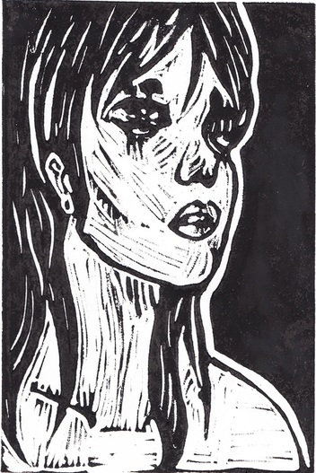
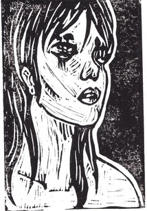
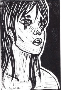
Rot
Block Print
22x15cm
2015
First in the "Roots" series, this block print was inspired
by the German Expressionism movement. The mushrooms
coming out of the eyes symbolize rotting out from the
inside, and the black/white contrast suggests that this
was a slow process with the small white border between a full
black background and the person. The expression on
the girl's face is one of discontent yet you can tell that
she is not going to be able to change what bothers her.
|
(1) Lichtenstein, Roy. Ohhh...Alright... 1964. Private collection.
(2) Herman Max Pechstein (German, 1881-1955), Kopf / Head (Fechter 149). Original woodcut, 1920. (3) Keiko Nobumoto, still from Cowboy Bebop, 1998. |
Planning Illustration has always been one of my ideal career choices. While doing a block print may not seem like the type of medium that illustration would be utilized, it helped me a lot in helping me plan for what I really wanted to do on my print. I spent a lot of time drawing out what I wanted my prints to look like, until I remembered that whatever I had carved out on the linoleum would be inverted if I followed the exact lineart that I had done on my sketches. Until then, I had been doing planning sketches that relate more closely to the pop art movement, specifically Roy Lichtenstein and the women he painted. "Ohhh...Alright..." (1) inspired me not only because of the high contrast pop art aspect of it but the facial expression as well as the illustrative qualities. This piece by itself influenced two of my planning sketches. Three more were inspired more by movies and TV shows I had watched as a child, mainly being anime styled movies such as by Studio Ghibli and series such as Cowboy Bebop (3). The last sketch was spurred by the German Expressionism movement (2). At this point I didn't have a specific running theme; nearly all of my sketches had different themes besides the final two I had worked on. Eventually, I took the pop art influence and rolled that together with my background on Japanese styled cartoons and created my final sketch.
At the end I was stuck between my fifth and sixth sketches (shown below). Both have the same theme of mistreatment of our own bodies and basically rotting from the inside. This symbolism is shown clearly with mushrooms sprouting from the eyes of both of the subjects. I used a high contrast between black and white for my sketches, completely filling in the areas that needed to be done so I could have a perfectly clear idea of what needed to be done. The lack of color in this piece helps add emphasis to the theme of slow destruction. |
Process
At first, I had used my first "final" sketch (Final Sketch #1) that I had been planning on using the entire time I was making other sketches. I did a graphite transfer in order to move the image over onto the linoleum, and I used three different carving tools to create a block print. I made the image inverted compared to the original sketch on purpose because I felt as though it added higher contrast. It was also much easier for me to work by only carving out where my graphite transfer was. I used mostly thin cutting tools to be able to create small contour lines.
When I had completed the carving, I got straight to inking my print and beginning to create prints on drawing paper. It was more difficult to get an appropriate texture than I had originally anticipated. After I had completed my first print, I realized this process was going to be much more difficult than I thought before. The ink was so thickly printed onto the sheet that it was coming off three-dimensionally in a very obvious way. I made a few more prints before I realized that the problem was not how much ink I was putting on the linoleum but it was how gently I was pressing down on the print to transfer it onto the paper. After that discovery I had made a few very nice quality prints, but something was off. I didn't like my image at all. The inverted style did not have much contrast, because the skin, hair and background were all black and the emphasis that was present in the sketch had basically disappeared. My artists inspiration had also gone away. There is a hint of being influenced by German expressionism in the piece, but it is not as prominent as I had wanted.
When I had completed the carving, I got straight to inking my print and beginning to create prints on drawing paper. It was more difficult to get an appropriate texture than I had originally anticipated. After I had completed my first print, I realized this process was going to be much more difficult than I thought before. The ink was so thickly printed onto the sheet that it was coming off three-dimensionally in a very obvious way. I made a few more prints before I realized that the problem was not how much ink I was putting on the linoleum but it was how gently I was pressing down on the print to transfer it onto the paper. After that discovery I had made a few very nice quality prints, but something was off. I didn't like my image at all. The inverted style did not have much contrast, because the skin, hair and background were all black and the emphasis that was present in the sketch had basically disappeared. My artists inspiration had also gone away. There is a hint of being influenced by German expressionism in the piece, but it is not as prominent as I had wanted.
Original Print #1
|
Original Print #2
|
|
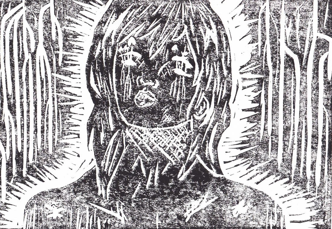
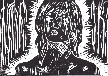
So, after that point, I flipped over my linoleum and began working on the back. I did a graphite transfer of my second favorite sketch (Final Sketch #2). I decided that I was not going to make this one inverted in order to make my original emphasis and balance really stand out. Carving around contoured lines was a lot harder than I thought, and I was very nervous that I was cutting too deep. However I never ended up cutting through the linoleum, which was surprising because of the carving already on the other side of it. My first print turned out not looking like my sketch exactly, but more closely resembling a German Expressionist piece. This made me feel as if I was doing something correctly, that my print was finally turning out how I wanted it to and did not look bad either. The balance between black and white was finally perfect in my piece. There was just enough movement to catch the eye and keep it going along the piece.
ReflectionAs seen to the right, I improved each time I made a new print. It took me over twenty tries between those two examples and the final product to get something clean and smooth yet with high contrast and a sketchy sort of look. I think my greatest challenge not only on this project but any project I do is sticking with the original thing that I choose. In this project I had this big idea that I thought was going to be fun to do and neat looking but it ended up just looking like something I rushed through and did off the top of my head. With my second sketch I paid a lot more attention during the process and really tried to picture what it would look like when it was finished instead of focusing on what I was doing in the moment. My final product uses a lot of lines as shading because it is impossible to blend on a block print and stippling would have done my piece no justice as a German Expressionism inspired piece. Overall I am proud of how this project has helped me grow by experimenting with a medium that I am not used to. I have used linoleum carvings before, but that was five years ago and I surely did not remember how difficult it was to create a line exactly where you want it. However these difficulties did not hinder my final piece's quality, and I am quite happy with how it turned out.
|
First attempt at second print
Attempt #2
|
