No Calm, All Storm
|
Photography and Digital Media
17.7 x 20.3cm December 2016 |
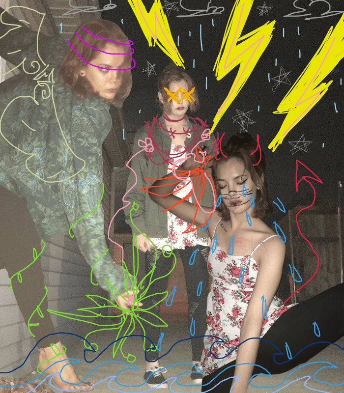
This piece focuses on the multiple emotions consistently running through the artists' mind as well as observation of movement through modelling and positioning. The movement as well as contrast between the opposing figures suggests an emotional turmoil. Themes explored with the help of color include emotion, identity and growth.
|
Planning
Over the course of November as well as December I had been experimenting a lot with the timer camera on my phone and different mediums of expression. I wanted to dabble in photography for at least one of my projects this semester, and I thought it would be a great idea to utilize some of the photos I had already taken (minding that they were at a low point in my emotional state) to create my final project. Around this time as well, I had become very interested in a digital artist named FERN, or CLUB FERN. Her art projects include not only photography but incorporate digital elements as well, and this intrigued me. I began thinking of ways I could incorporate that interesting style, but keep my own as well and add my own meaning and emotions behind it. FERN's art is mostly just for fun and isn't there for emotional impact, but I wanted my piece to have that impact behind it. I began searching for a second inspiration for my project and thought back to artists that I have appreciated for a large portion of my life.
|
|
The second artist that I had ended up thinking of is an illustrator by the name of Lynda Barry. Her art style is very different from my own style but the way she expresses emotions in a very cartoonish style is what I wanted to be able to utilize. Most of her art is within her writing style as well, but there are pictures to accompany every excerpt and I love this concept. In the specific example I put to the left - the fourth panel from a piece called Marie the Liar - the tears coming from the main character Arna's eyes were a very specific element that stood out in my mind.
Planning Sketches |
Process
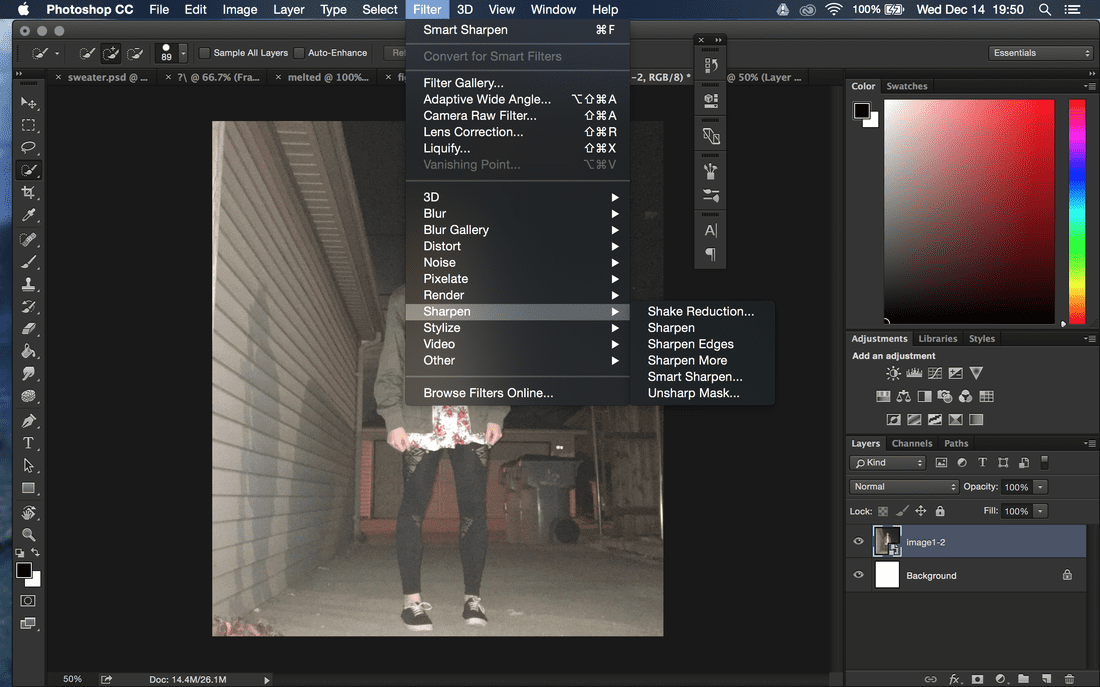
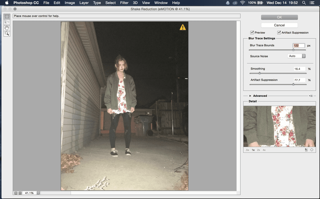
I ended up choosing three photos that expressed a lot of motion within them. These were all taken on my phone with a timer camera. My first image, the one that would become my background was extremely blurry, so I looked up a tutorial online on how to sharpen the image in Photoshop CC and did exactly that. Once I was satisfied with the background, I began thinking of how to create sort of an asymmetrical type of piece. I had two other photos that I wanted to put into my piece, so I looked at those and saw how I could create the vision I wanted.
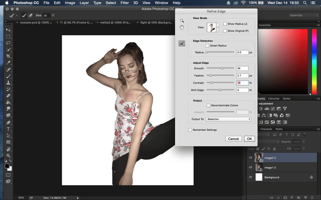
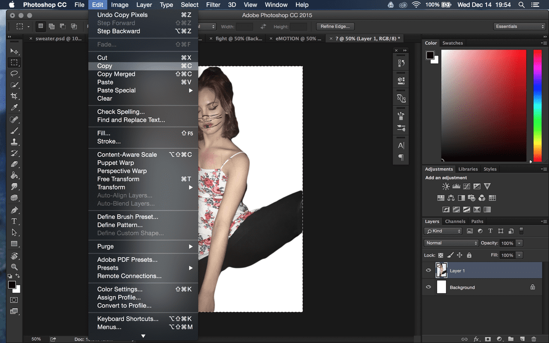
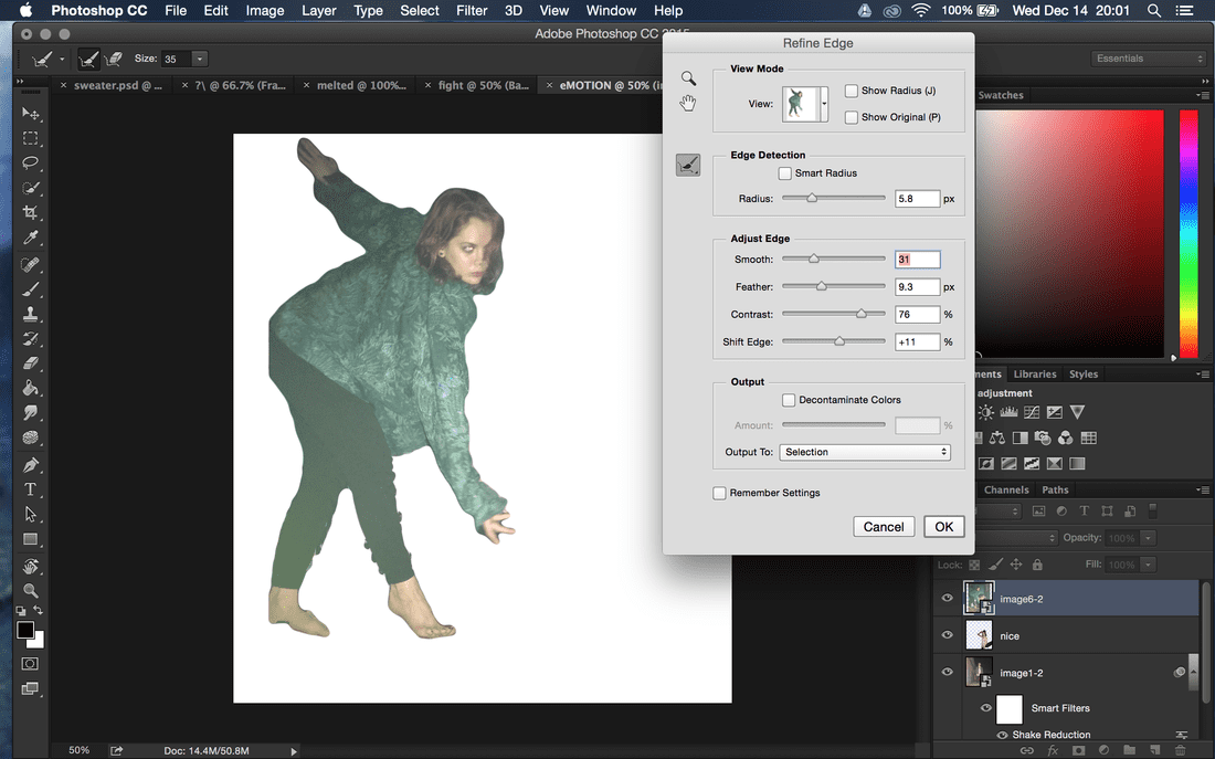
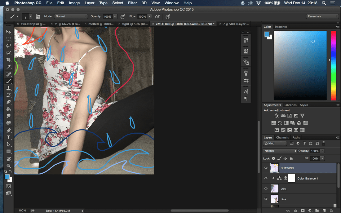
I used the Quick Select tool to cut out the first figure in the white dress that wasn't the background image; I refined the edge using the refine edge option and made the contrast between the edge and whatever would be behind it very apparent. I experimented a lot with the Free Transform tool to edit how big the layer was, and made it just big enough to take up the empty space within the bottom right corner while hiding that the leg was cut off in the original photo.
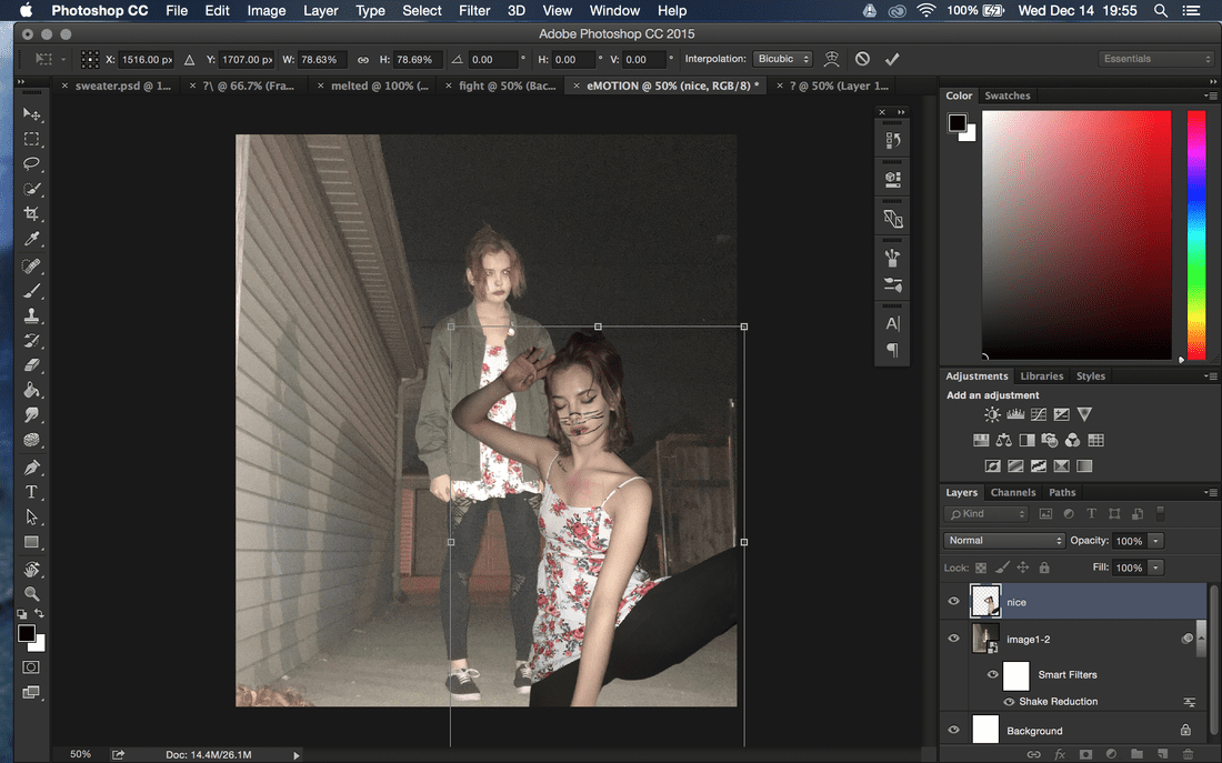
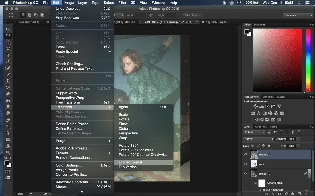
The second image with the green and blue jacket was a little more difficult to do because I kept trying to flip the image to put on the other side, however, it flipped the entire canvas and all the layers and it was difficult to find a solution to it. Once I was able to flip it, I quick selected the figure from it and made it seem so much bigger than the other two figures because the outfit was different from them. I also utilized a correctional tool called Color Balance and created a clipping mask on the layer so it only affected that layer. This allowed me to play with the tones in the image and I made it less cool toned and added more yellow and magenta tones in order to create more unity in my final piece.
After all the photos were put together, I was finally able to draw over all of them. I created the last layer and began to simply draw what I felt. I utilized colors from all over the color spectrum instead of sticking within just one palette and this almost randomness pulls the cutouts of figures togethers by the spontenaity of it.
I used the Quick Select tool to cut out the first figure in the white dress that wasn't the background image; I refined the edge using the refine edge option and made the contrast between the edge and whatever would be behind it very apparent. I experimented a lot with the Free Transform tool to edit how big the layer was, and made it just big enough to take up the empty space within the bottom right corner while hiding that the leg was cut off in the original photo.
The second image with the green and blue jacket was a little more difficult to do because I kept trying to flip the image to put on the other side, however, it flipped the entire canvas and all the layers and it was difficult to find a solution to it. Once I was able to flip it, I quick selected the figure from it and made it seem so much bigger than the other two figures because the outfit was different from them. I also utilized a correctional tool called Color Balance and created a clipping mask on the layer so it only affected that layer. This allowed me to play with the tones in the image and I made it less cool toned and added more yellow and magenta tones in order to create more unity in my final piece.
After all the photos were put together, I was finally able to draw over all of them. I created the last layer and began to simply draw what I felt. I utilized colors from all over the color spectrum instead of sticking within just one palette and this almost randomness pulls the cutouts of figures togethers by the spontenaity of it.
Reflection
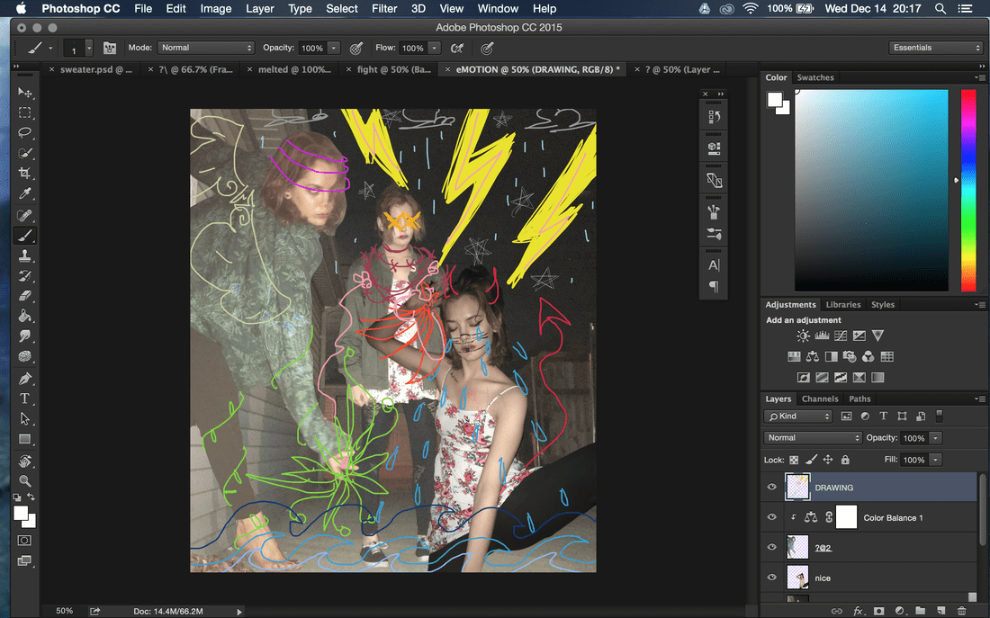
The craziness and roughness of the final piece really appeals to how I felt at the time I made the piece. The randomness of it and the scrambled pieces seem all so different from eachother but they come together in the end visually due to the unified line weight. I made the figure on the left have angel wings and three pink rings surrounding the face; the angel wings contrast with the devil figure on the left. The angel/devil contrast in the piece is to represent the nearly bipolar tendencies in my mind; I feel so confident in myself and love myself but minutes later I turn into a self depreciating pile of sad and the contrasts are so confusing and unexpected that I don't know what to do. This is what translates into the third background figure in that there is a red-pink barbed wire which symbolizes the confusion that I face in my life and the pain that I feel whenever I make a decision; I almost always regret everything I do in at least one aspect. My indecisive tendencies are pictured in this piece through not only that but the organic lineart in either of the opposing figures hands. The colors I used were meant to create an even stronger sense of contrast between the two figures and I believe this was very successful. The larger figure is the angel and this size difference symbolizes that even when I do regret my decisions, I always pull through with the best me.
Finally, the last symbol that I put into my piece was the stormclouds as well as the lightning bolts. Storms and lightning are some of my biggest fears and while I was creating the piece it only seemed natural to put those objects into my piece. Mixing in my fear with my insecurity and indecisivity made this piece that looks, at first glance, to be completely random and rushed really helped me to love this piece. Being able to visually interpret the emotions that I feel the strongest all the time is helping me emotionally recover from an extremely hectic past couple months.
The final project itself was not very successful in terms of artistic value, but emotional value trumps over in all my artwork. The sense of identity and the use of myself as the main figure is a recurring theme throughout all my artwork and being able to continue that theme even with my last project has helped me find exactly my calling in digital artwork as well as assist in a sense of closure.
